
.svg)
If you think visitors read your website word-for-word, think again. Eye-tracking studies reveal a surprising truth—and five ways to fix your copy so it actually works.
You poured hours into writing your homepage. You chose every word carefully. But here’s the uncomfortable truth: most people won’t read it.
According to multiple eye-tracking studies, users don’t consume websites like novels—they scan them. And they do it in a predictable, patterned way. If your copy doesn’t fit that scanning behavior, it doesn’t matter how beautiful or clever it is—it simply won’t convert.

The F-Shaped Pattern: What Eye-Tracking Reveals
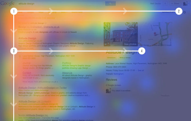
Back in 2006, the Nielsen Norman Group published a landmark study using eye-tracking technology. The results showed that users read web content in an F-shaped pattern:
- First, they scan the top of the page horizontally.
- Then, they move down a bit and scan again—often a shorter horizontal pass.
- Finally, they skim vertically down the left side, barely glancing at full paragraphs.
The implications? If your message isn’t in the right spots, it’s invisible.
And it gets worse. A 2020 follow-up found that this behavior hasn’t changed, even with mobile-first design and responsive websites. People are still rushing, scanning, and filtering.
Why This Matters for Your Website Copy
Website copy isn’t about storytelling—it’s about guidance. Your job isn’t just to inform, it’s to make decisions easier. If your site is packed with walls of text, clever metaphors, or vague slogans, you're losing people.
The harsh reality: users don’t read, they hunt. They’re looking for relevance, clarity, and a reason to stay. If they don’t find it in the first few seconds, they’re gone.
5 Rules for Writing Web Copy That Actually Works
1. Front-load Your Message
Put the most important point in the first few words of every heading and paragraph. Don't save your punchline for the end. Users won’t get there.
Instead of:
“With years of experience in design and strategy, we deliver solutions tailored to…”
Try:
“We build conversion-driven websites, fast.”
2. Use Clear, Scannable Headings
Break up your page with meaningful subheadings. Think of them as billboards that should communicate the core idea even if the user reads nothing else.
Bad: “Why Choose Us”
Better: “Faster Builds, Lower Costs, Real Results”
3. Keep Paragraphs Short
No one wants to read a dense block of text. Stick to 2–3 lines per paragraph, max. Make your copy breathe.
4. Use Lists and Visual Breaks
Bullet points, numbered lists, bold text—these aren't just stylistic. They create visual anchors. They slow the scroll and guide the eye.
For example:
- Clear benefits
- Pricing highlights
- What makes you different
- Call-to-action prompts
5. Speak Like a Human, Not a Brand Robot
Avoid jargon. Be direct. Users don’t want to decode. They want clarity and confidence.
Instead of:
“We leverage synergistic technologies to drive operational outcomes.”
Say:
“We build tech that helps your team move faster.”
Conclusion: Write for Real Behavior, Not Ideal Readers
You’re not writing a novel. You’re writing a tool. And tools must be functional.
When you design your copy for scanning—not reading—you respect the way people use the web. You make decisions easier. You help users move forward. And ultimately, that’s what turns attention into action.
So no, people aren’t reading your website. And that’s exactly why it’s time to write it better.
Its partial or total reproduction, as well as its translation into any language, is prohibited without the written authorization of its author and Braindy™
Copyright © Braindy™
.svg)
.svg)
.svg)
.svg)